The best Figma accessibility plugins in 2026
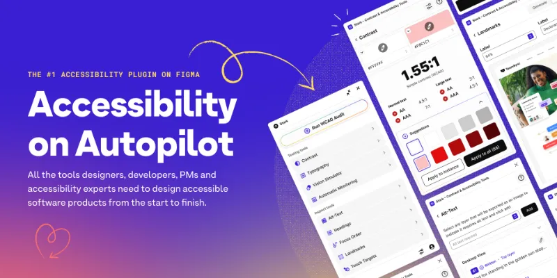
Stark is the most-used Figma accessibility plugin, with 577K users. It checks color contrast and typography, adds WCAG annotations for handoff, and runs in Figma Design, Dev Mode and Figma Slides.
Top 20 picks

Stark
#1 · 577K users
Quick answer
Our top picks
- #1
Most used
Stark
by Stark
Stark fixes color contrast and typography issues and adds WCAG annotations for developer handoff. It runs across Figma Design, Dev Mode and Slides, so designers and developers can use the same tool. It's a full suite; for a quick ratio on one color pair, the native color picker is faster.577K 10KFree - #2
Best for text on images and gradients

Contrast
by Alex Carr
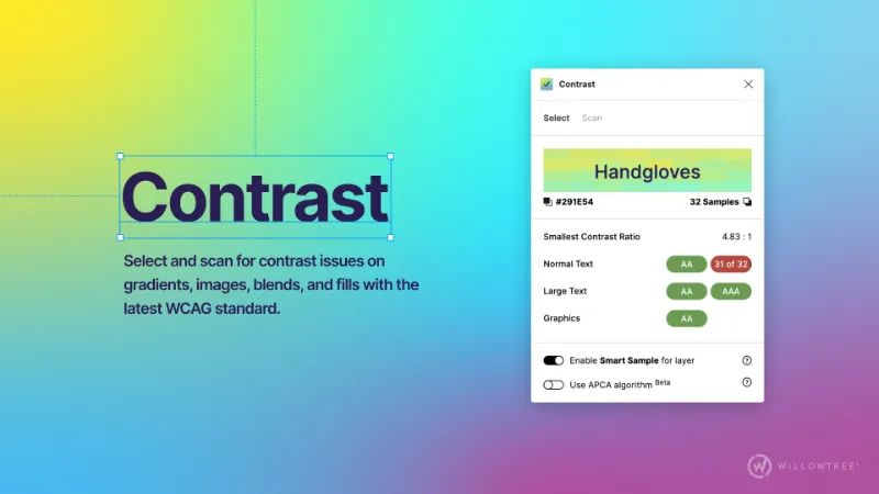
Contrast checks and scans for contrast problems on gradients, images, blends and fills as you work. With 515K users it's almost as widely used as Stark and does one job. It doesn't cover structure or annotations, so pair it with an annotation tool.515K 8.3KFree - #14
Best free all-round checker

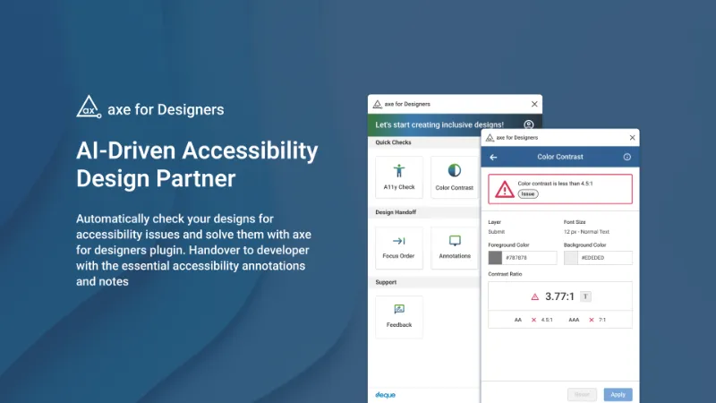
axe for Designers: A Free Accessibility Plugin
by Deque Systems
axe for Designers comes from Deque Systems, the company behind the axe testing tools many developers already run in code. It's free and aimed at catching issues before they reach development. Design-time checks can't see real code, so you still need to test the built product.23K 910Free
The full list
The 20 most-used Figma plugins for accessibility
- 01
Stark
Fix Color Contrast and Typography issues and add WCAG annotations for a smooth design to dev handoff
Free · 10K likes
577K10KFree - 02
Contrast
Quickly check and scan for contrast issues on gradients, images, blends, and fills.
Free · 8.3K likes
515K8.3KFree - 03
 315K4.7KFree
 - 04

UI Color Palette /one・WCAG Color Palette Manager for Apps & Websites
Color Palettes that meet WCAG Guidelines and Operations (tailored for individuals)
Free + $8/mo · 814 likes
92K814Free + $8/mo - 05
 82K474Free
 - 06
 72K341Free
 - 07
 54K186Free
 - 08
 41K123Free
 - 09
 38K1.6KFree
 - 10

Adee Comprehensive Accessibility Tool
Adee accessibility testing tool checks color contrast, simulates color blindness, tests touch size,
Free · 629 likes
32K629Free - 11
 31K1.2KFree
 - 12
 29K329Free
 - 13

Include
Create a11y annotations including landmarks, headings, alt text, reading order, contrast, and more
Free · 1.7K likes
24K1.7KFree - 1423K910Free
- 15

Text Resizer
Free · 398 likes
23K398Free - 16
 19K72Free
 - 17

Accessibility Simulator
Improve your design's accessibility by simulating visual impairments and ensuring WCAG compliance.
Free · 160 likes
16K160Free - 18
 15K164Free
 - 19
Contrast Grid
Check contrast multiple foreground and background color combos for a11y.
Free · 336 likes
11K336Free - 20
 10K647Free
Buying guide
What to look for
For a single color pair you may not need a plugin. Figma's color picker has a Check color contrast option on every plan that shows the WCAG AA and AAA result and can adjust a color to the nearest passing value. Plugins add what the picker can't: scanning a whole frame, checking text over gradients and images, simulating color blindness, and writing notes for screen readers and focus order.
Contrast is only one part of WCAG, but it dominates this list; most of the top 20 are contrast checkers. If you install more than one, make sure one covers structure (headings, landmarks, reading order), such as Include or Accessibility Assistant, which also appear on our annotation plugins list.
- 01
Scope of a check
Checking one selected pair is fine while designing. Before review you want a plugin that scans a whole frame or page and lists every failure.
- 02
Complex backgrounds
Text over images, gradients and blended layers is where manual checks fail. Contrast by Alex Carr is built for exactly this.
- 03
Standard used
Most tools check WCAG 2.x ratios. If your team is testing APCA, the proposed method for WCAG 3, confirm the plugin supports it.
- 04
Beyond contrast
Color blindness simulation, touch target size, text resizing and focus order catch problems contrast checks miss. Adee and Accessibility Simulator cover several of these.
- 05
Handoff output
A passing check helps nobody downstream if it isn't written down. Prefer tools that leave annotations developers can read.
FAQ
Frequently asked questions
Does Figma have a built-in contrast checker?
Yes. Open the color picker on a text or fill color and click Check color contrast. It shows the ratio against the background, whether it meets WCAG AA or AAA, and can adjust the color to the nearest passing value. It's available on every plan.
What contrast ratio does WCAG require?
WCAG 2.x level AA requires 4.5:1 for normal text and 3:1 for large text and for UI components and graphics. Level AAA raises text to 7:1 for normal text and 4.5:1 for large text.
How do I simulate color blindness in Figma?
Use a simulator plugin such as Color Blind, Adee or Accessibility Simulator, which preview your frame under different types of color vision deficiency. Check that state and meaning never depend on color alone.
How do I annotate designs for screen readers?
Use Include or Accessibility Assistant to mark headings, landmarks, alt text and focus order on the canvas. On paid plans, native annotations also have an Accessibility category. See the Figma annotations guide.